“Highlighter” is my design for a proposed .pdf and .epub markup software that addresses shortcomings in the current major apps used for annotating texts—principally Adobe Acrobat and Amazon Kindle Reader.
When working with a physical book, highlighting is a process of transforming a general text—which is meant to communicate to as broad an audience as reasonably possible—into a personal reference document specific to the annotating reader: a collaborative, mosaic, multidimensional piece that’s capable of remaining a permanent extension of that reader’s comprehension of the covered topic.

Page 6 of the introduction of The Cultural Politics of Emotion, by Sara Ahmed. My highlighting in this book is detailed and extensive, and it is both my foremost illustration of the functionality that I aim to capture in “Highlighter” and the example text that I use throughout the demonstration content, further down.
Digital annotation should by all rights be a revolutionary improvement over this capacity of physical texts—incorporating hypertextuality, faster and more fluid access, and an infinite margin for notes and context.
So you can imagine my frustration at the available solutions failing to even approximate the utility of paper highlighting. I’ve directed that frustration into designing this prototype.
Concept and idea development

This storyboard depicts the user interface steps around the core function of “Highlighter,” the ability to establish a passage as highlighted and then adjust the way those highlights appear visually.
The most basic idea in “Highlighter” is that there’s a tracked difference between the visual display of highlights and the selections of text stored as single notes. This way, users can save and reference passages that provide the full necessary context for an idea, but still only place visual emphasis on key terms in those passages.

This whiteboard brainstorm goes over some of the functions “Highlighter” would have, including text truncation, passage linking, and a clearer illustration of the highlighting function depicted in the sketchbook storyboard.
Searching and browsing highlights is an important core function to support this base mechanism; looking only at the page, highlights don’t necessarily need to maintain a continuity across gaps in the visual display. But when browsing or searching a collection of emphasized lines, it becomes impractical-bordering-on-useless to just get lists of individual words, highlighted because they’re a key concept in a sentence.
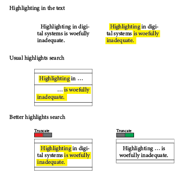
This demonstration, made in Adobe Illustrator, shows the difference in functionality between a tool that supports continuity of quotes and one that doesn’t.
I also explore truncation as a powerful function in “Highlighter,” using the details of the more selective, second-layer highlight to remove unnecessary or irrelevant clauses and pull together into a clear line just the concepts a user means to emphasize. As texts get more complex, this would be an increasingly valuable tool to keep track of more difficult (or less clearly written) paragraphs.
Wireframe prototype and interviews
I made a wireframe walkthrough of the basic functions of “Highlighter” using Adobe XD (video walkthrough and image gallery below), and did user interviews with peers who matched the persona that would be interested in an annotation app. Through the process of interviewing these potential users, I identified other functions that ought to exist—some of which I added in later iterations of the wireframe—and other use cases outside of annotating academic texts.
One user, for example—a former stage manager—pointed out that she could’ve used this app to annotate scripts to extract a document that just summarized every necessary cue, which could have cut a significant burden out of her job and removed a lot of unnecessary and potentially distracting information from a document as complex as a script for staged theater.
Highlighter app (wireframe demo) walkthrough video

Basic layout wireframe for Highlighter, before anything is done to the text. Using page 6 in the introduction of The Cultural Politics of Emotion, by Sara Ahmed.

Lines highlighted in Highlighter in much the same way they are in any other annotation platform.

Double-clicking on a highlight opens isolation mode, wherein a user can adjust the specific visual presentation of the highlight.

Options include leaving some text that is part of the overall highlight out of the visually highlighted section, and underlining rather than fully highlighting some parts.

After exiting isolation mode (by clicking anywhere outside the isolated passage) the new highlight appears in the sidebar.

Items in the sidebar can be truncated, replacing sections not fully highlighted with elipses.

A fully highlighted page might be much more complex than the previously illustrated one. Significant functions illustrated here include the use of several colors, and highlighting of certain passages with more than one color simultaneously.

The sidebar supports filtering the list by color of highlight. Other filtration options could include tag selection, and direct word search (both including and excluding search of the terms in user comments)

Selecting an individual highlight shows comment and tag boxes, a delete button, and share and export options (pictured: tweet, export to Word, export to Markdown)

Comments can be as long as a user wants or needs them to be. Tags might be used for context, ideas discussed, or aspects of the user’s life outside the text, such as the class they’re reading this text for.

The Tweet function would link to a user’s Twitter account, so they can directly share quotes from works as they read them. Includes options for including comments or tags, parenthetical vs full citation, and the ability to directly edit the text before sending.
Animation and branding
The functions I’m describing in Highlighter can all be replicated in existing software, albeit with great difficulty and relying on a whole lot of klugey integrations and creative misapplication of existing functions. The shortcomings of the existing market aren’t a matter of the simple absence of features; rather, they’re a failure of user experience.
By the very nature of the act, users tend to annotate when they engage with works that push the edge of their cognitive capabilities. To whatever extent an application expects its users to consciously spend time figuring out how to use its features, that application is a barrier, rather than an aid, to comprehension of the work in focus. By this measure, existing offerings fail catastrophically.
Strong UX design is at the core of what makes this product functional, so I’ve animated a brief illustration of the app’s basic operation, in which I hope to demonstrate some aspects of design that aren’t centered in the wireframe.


I designed an animated logo and wordmark for “Highlighter” (right). The look I was going for is 1980s consumer software graphic design—the impression I want new users to get of the app is that this program has quietly existed for decades, and they’ve only just found out about it with the most recent update.
The purpose of annotation is to turn the ephemeral experience of reading a text into an artefact that extends the utility of that experience forward in time. It is therefore vital for Highlighter to carry itself as a piece of software that will outlive its users.
Next steps
Moving forward with “Highlighter” I want to talk to potential users with access needs that are unmet by existing tools. I’ve been following campaigns calling for large platforms and software developers to make their tools more accessible to the diversity of access needs that users bring to the experience, and I want to incorporate those values into my design philosophy. I also want to identify possible curb cuts—considerations made for users with disabilities that improve the product for everyone who uses it.


